Introducing

Moriston

A sans-serif typeface withunusually high contrast—and enthusiasm!
by Riley Cran

Adding contrast to a conversation makes your voice stand out. Moriston is a sans-serif grotesque available in 6 reliable weights, with support for over 200 languages and a variety of additional number styles. Designed by Riley Cran, and available from your friends at the Lost Type Co-op.

Pay-What-You-Want for a Personal Use License. Purchase a Commercial Use License for $75 and receive a kickass risograph print at no extra charge!

Get Moriston
6 5 a s p 2 ß Q m G m % 7 M @ 0 d & ® ? 8 V 4 £
Moriston
Moriston
Moriston
Airplane travelsROLLFAST BICYCLEScottish River GlensLOCAL LOCHVery good Jazz albumsNew York
  1. 3
  2. 4
  3. 5
  4. 6
  5. 7
  6. 8
  7. 9
  8. 10
  9. 11
  10. 12
  11. 1
  12. 2

Moriston speaks your language

Abenaki, Afaan, Oromo, Afar, Afrikaans, Albanian, Alsatian, Amis, Anuta, Aragonese, Aranese, Aromanian, Arrernte, Arvanitic (Latin), Asturian, Atayal, Aymara, Azerbaijani, Bashkir (Latin), Basque, Belarusian (Latin), Bemba, Bikol, Bislama, Bosnian, Breton, Cape, Verdean, Creole, Catalan, Cebuano, Chamorro, Chavacano, Chichewa, Chickasaw, Cimbrian, Cofán, Cornish, Corsican, Creek, Crimean, Tatar (Latin), Croatian, Czech, Danish, Dawan, Delaware, Dholuo, Drehu, Dutch, English, Esperanto, Estonian, Faroese, Fijian, Filipino, Finnish, Folkspraak, French, Frisian, Friulian, Gagauz (Latin), Galician, Ganda, Genoese, German, Gikuyu, Gooniyandi, Greenlandic (Kalaallisut), Guadeloupean Creole, Gwich’in, Haitian Creole, Hän, Hawaiian, Hiligaynon, Hopi, Hotcąk (Latin), Hungarian, Icelandic, Ido, Igbo, Ilocano, Indonesian, Interglossa, Interlingua, Irish, Istro-Romanian, Italian, Jamaican, Javanese (Latin), Jèrriais, Kaingang, Kala Lagaw Ya, Kapampangan (Latin), Kaqchikel, Karakalpak (Latin), Karelian (Latin), Kashubian, Kikongo, Kinyarwanda, Kiribati, Kirundi, Klingon, Kurdish (Latin), Ladin, Latin, Latinosine Flexione, Latvian, Lithuanian, Lojban, Lombard, Low Saxon, Luxembourgish, Maasai, Makhuwa, Malay, Maltese, Manx, Māori, Marquesan, Megleno-Romanian, Meriam Mir, Mirandese, Mohawk, Moldovan, Montagnais, Montenegrin, Murrinh-Patha, Nagamese Creole, Nahuatl, Ndebele, Neapolitan, Ngiyambaa, Niuean, Noongar, Norwegian, Novial, Occidental, Occitan, Old Icelandic, Old Norse, Onĕipŏt, Oshiwambo, Ossetian (Latin), Palauan, Papiamento, Piedmontese, Polish, Portuguese, Potawatomi, Q’eqchi’, Quechua, Rarotongan, Romanian, Romansh, Rotokas, Sami (Inari Sami), Sami (Lule Sami), Sami (Northern Sami), Sami (Southern, Sami), Samoan, Sango, Saramaccan, Sardinian, Scottish, Gaelic, Serbian (Latin), Seri, Seychellois Creole, Shawnee, Shona, Sicilian, Silesian, Slovak, Slovenian, Slovio (Latin), Somali, Sorbian (Lower Sorbian), Sorbian (Upper Sorbian), Sotho (Northern), Sotho (Southern), Spanish, Sranan, Sundanese (Latin), Swahili, Swazi, Swedish, Tagalog, Tahitian, Tetum, Tok, Pisin, Tokelauan, Tongan, Tshiluba, Tsonga, Tswana, Tumbuka, Turkish, Turkmen (Latin), Tuvaluan, Tzotzil, Uzbek (Latin), Venetian, Vepsian, Volapük, Võro, Wallisian, Walloon, Waray-Waray, Warlpiri, Wayuu, Welsh, Wik-Mungkan, Wiradjuri, Wolof, Xavante, Xhosa, Yapese, Yindjibarndi, Zapotec, Zarma, Zazaki, Zulu, and Zuni.

Fall 2015

Read
Moriston

The spark for Moriston came from an unexpected source during my first visit to New York City in the fall of 2013. While waiting outside the Evolution store on Spring St. between Greene and Mercer in Soho, I saw a 50’s Rollfast bicycle leaning against a tree.

The design of the bicycle itself was gorgeous, and there was something special about the characterful R monogram on the bike frame. Yet, it was the logotype that really caught my eye.

Set in ultra-bold, italic, high contrast sans-serif caps, its letterforms were familiar, but struck me as an under-explored genre in type.

It occurred to me that if you stripped away the idiosyncrasies, these letterforms were more or less gothic sans caps. Although there are many ways of looking at what these forms could be with less contrast, I saw them as similar to the Benton Gothics.

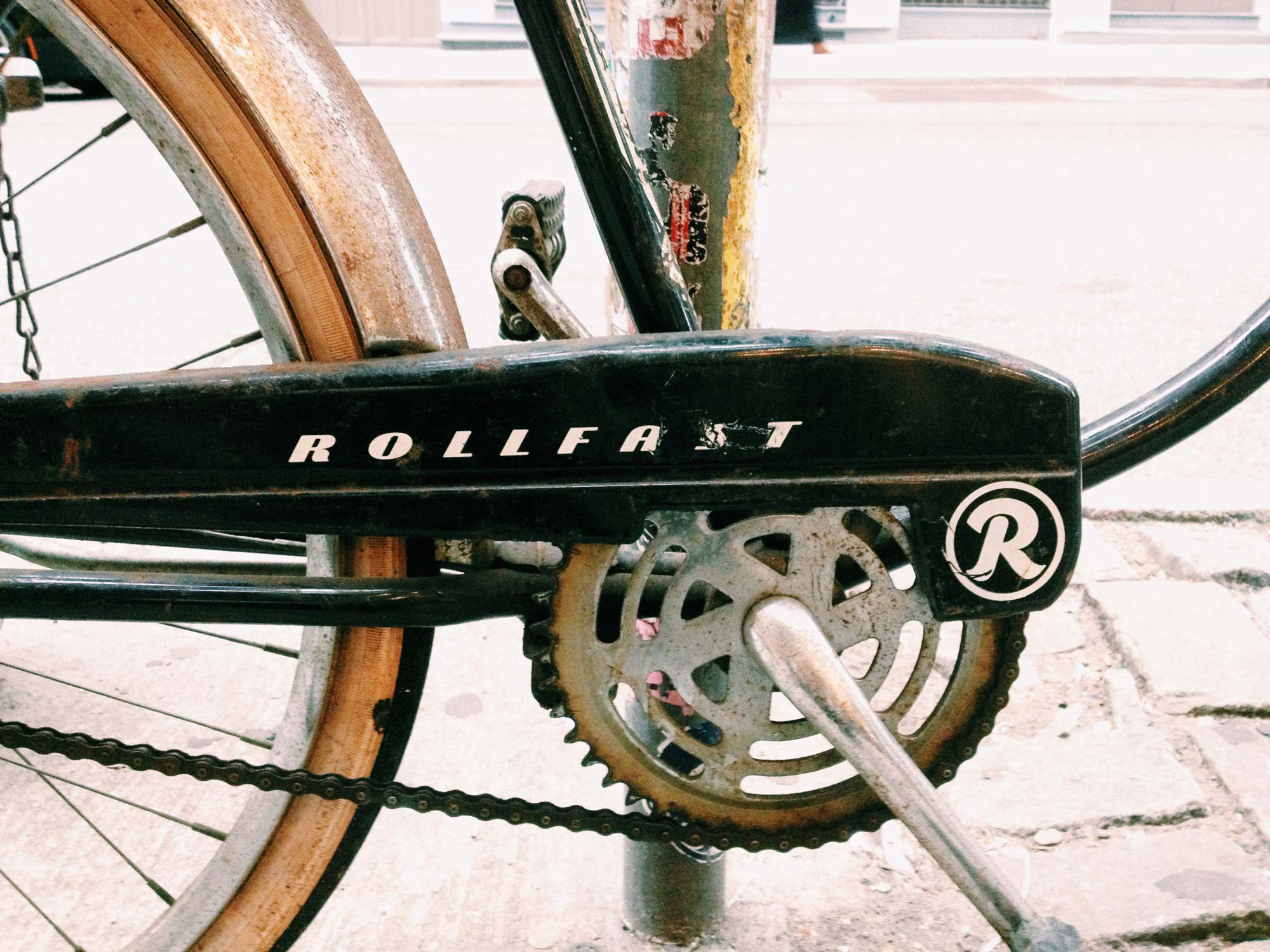
The rollfast bicycle logotype, as I saw it in New York. Check out that round top A!

What would happen if an entire family was built this way? An early 20th century grotesque, shifted into new territory through noticeable higher contrast? Could the increased contrast modify the aesthetic tone without sacrificing legibility, or feeling forced?

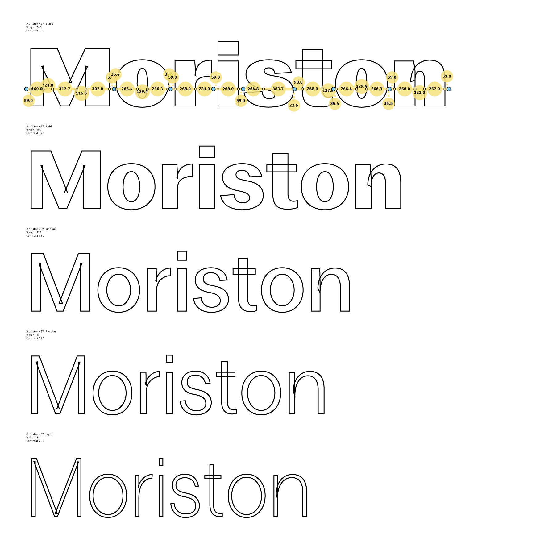
Working on the extremes of Moriston using interpolation. Interpolation is commonly used by type designers both as a sketching technique, and for generating the final or near-final weights of a type family.

Glenmoriston

One influence was Miller & Richard's Grotesque #7, produced around the turn of the century. It was around this time that the sans-serif really came into its own, with type designers like Miller & Richards in Scotland, Morris Fuller Benton in the US, and others influencing each other and sharing ideas across the globe.

I liked the idea that Miller & Richards work must have crossed the sea at some point and arrived in NYC. My family on my mother’s side did the same, immigrating from Scotland to Ellis Island at a similar point in time. My grandfather Glenn Morison Chronister, was actually named after a place in Scotland: Glenmoriston. This is a river glen in the Scottish Highlands that feeds Loch Ness.

I never got a chance to meet Glenn, but I grew up in a family that always told me I was the son he never had, and that he would be interested in the work I was doing. Seizing the opportunity to honor his name, and the birth country of my family on both sides, the typeface is named Moriston.

At first, light

Moriston’s contrast and fuller, rounder curves give it a certain sparkle both in print and on screen. The bolder weights have character, while the lighter weights are functional in larger pieces of text and offer a more neutral feeling without losing heart. Moriston includes a variety of features including small caps, multiple figure styles and support for 224 languages.

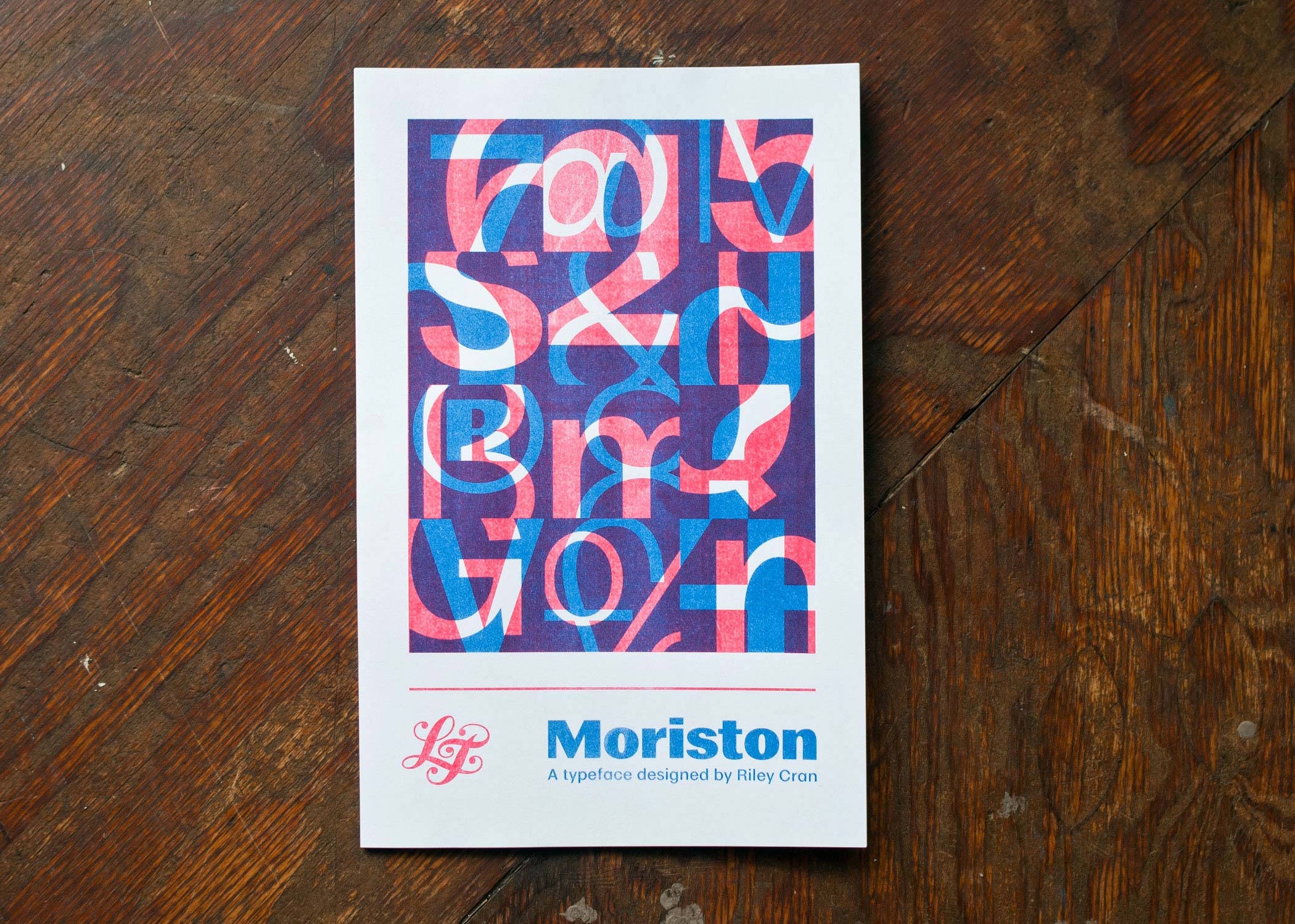
This 2 color risograph poster ships free with every commercial license sold in the USA. Purchase Moriston


Riley Cran
@rileycran

Riley Cran is a type designer and lettering artist based in the Pacific Northwest. He is the Operator and Co-Founder of The Lost Type Co-op, a collaborative digital type foundry.

Glenn Morison Chronister

Moriston is dedicated to the memory of Glenn Morison Chronister.